do4you — Visa Form-Filling Service
How We Helped a Visa Form Service Build a Clear, Trustworthy Brand for Non-Native English Speakers and Launch a Lead-Ready Digital Experience in 7 Days.
Summary
do4you’s founder built his service around a simple insight: most foreign nationals and tourists in South Africa are not sure how to fill out their visa application forms. His goal was to reach the foreigners and expats who needed that help the most — non-native English speakers who are already anxious about the immigration process — and convert them into WhatsApp leads through a clear, trustworthy landing page.
The obstacle was that do4you had no digital presence at all. Without a website, potential clients had no way to find the service, understand what they offered, or trust it enough to make contact. The audience needed a site that felt as simple and reassuring as the service itself — built from nothing, in plain language, for people who are already stressed.
The solution was a brand and landing page built entirely from scratch, around one rule: if a non-native English speaker cannot understand it in five seconds, it does not belong on the page. The result is a calm and focused landing page that removes every reason not to send a WhatsApp message — and within weeks of launch, it was receiving up to 200 visitors a day and giving do4you a direct line to convert that interest into WhatsApp enquiries for the first time.
The Complete Story
The Problem
The problem had three layers. Externally, the South African visa form system is genuinely complex — dozens of categories, each with different document requirements, and consequences that range from delays to outright rejection. Internally, the applicant feels alone. English may not be their first language. The forms are written in formal, technical English. They do not know who to trust or where to start. Philosophically, they believe navigating immigration should not require a legal background — but they cannot find help that feels accessible.
Our Role as the Guide
do4you steps in as the guide with one clear promise: we fill in the forms for you, correctly, the first time. Our role was to make that promise feel real before a single form is touched. Every design and copy decision was made with one question: does this make a nervous, non-English-speaking foreigner feel safe enough to reach out?
The Plan
The project unfolded in four steps over 7 days. We mapped the audience and identified their single biggest fear: submitting a form with errors. We built the brand and wrote all copy from scratch in plain, short-sentence language. We designed the full visual system — blue palette, icon-led service cards, and a hero that embodies the relief of having everything handled. And we structured every section toward one action: the WhatsApp button.
The Result
Within weeks of launch, do4you had a direct line to convert audience interest into WhatsApp enquiries for the first time — something that was not possible before the site existed. The landing page now receives up to 200 visitors a day.
Branding
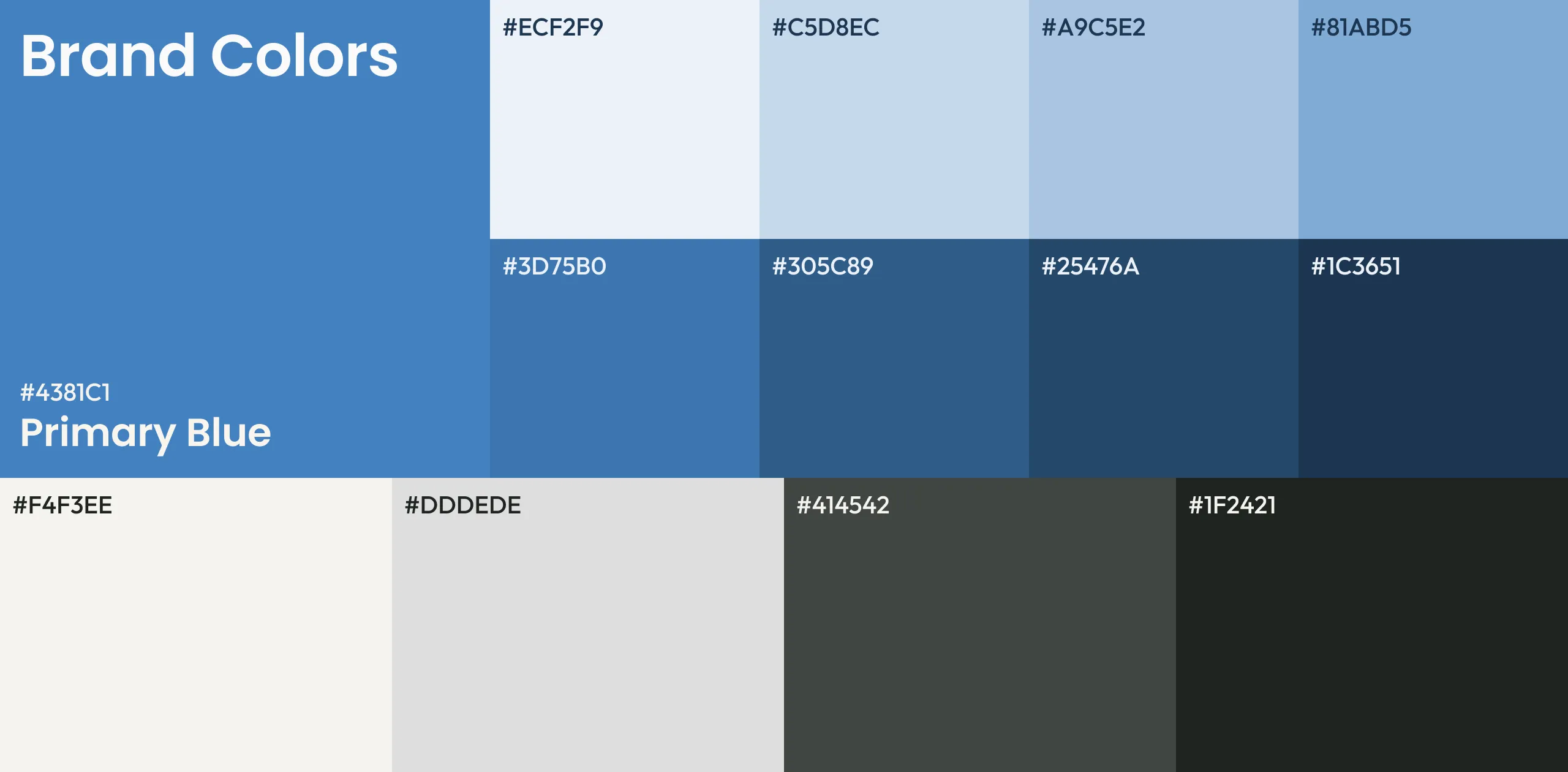
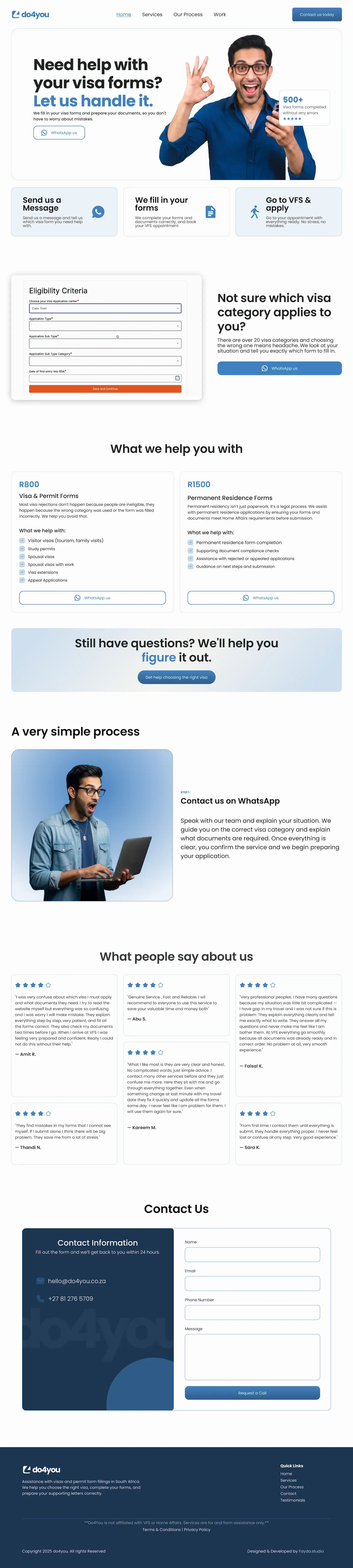
We built the visual identity from scratch with calm and clarity as the brief. The primary blue was chosen to feel trustworthy and approachable — it runs as a consistent thread through every CTA, icon, and highlight on the page. The off white background keeps the site warm without the clinical feel of pure white. Dark headlines maximise readability for readers at all language levels.
Typography was chosen for clarity above all else. Large, bold headings help non native readers orient quickly. Body text is set at a generous size with comfortable line height. No decorative fonts, no small print.
Design & Development
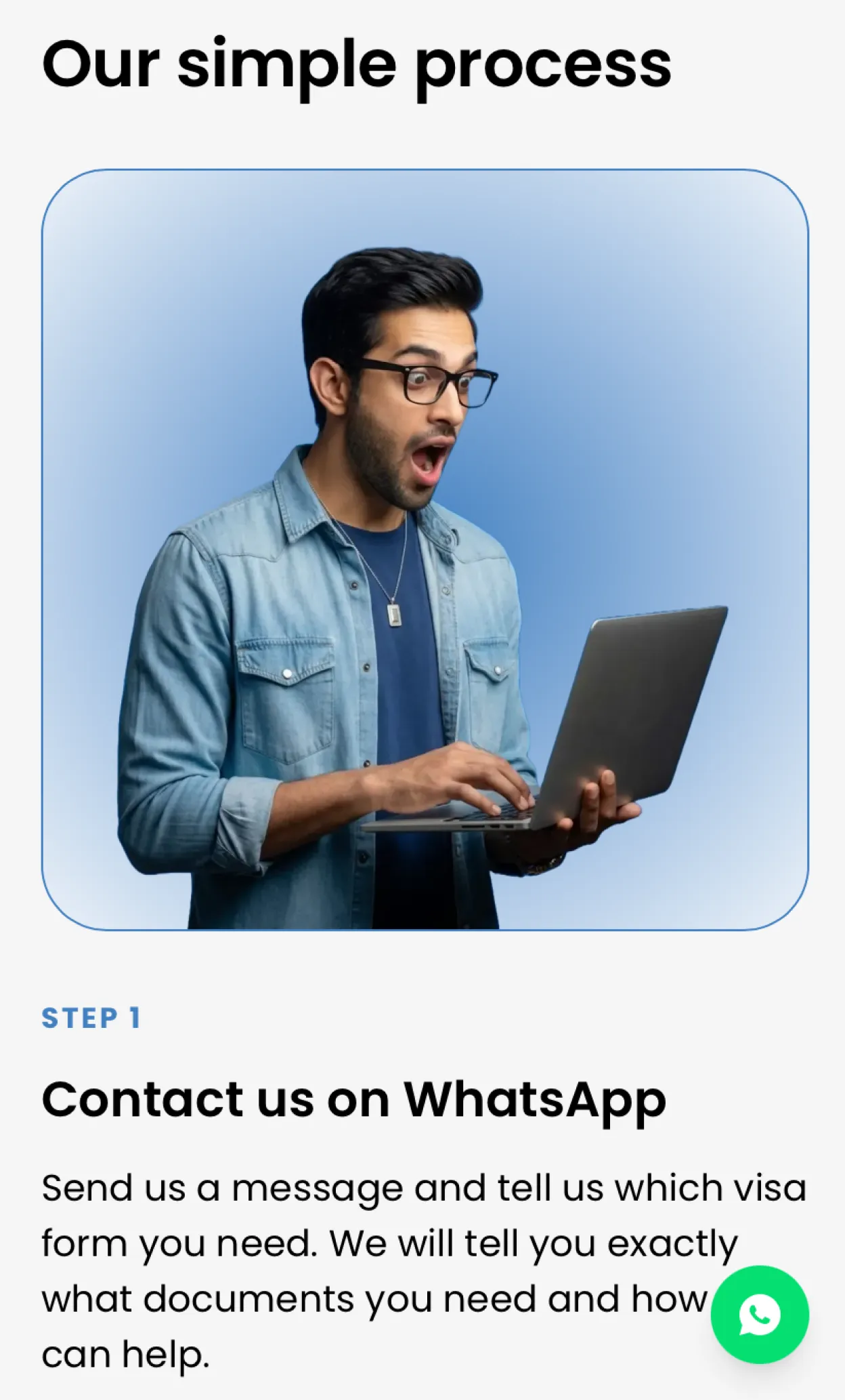
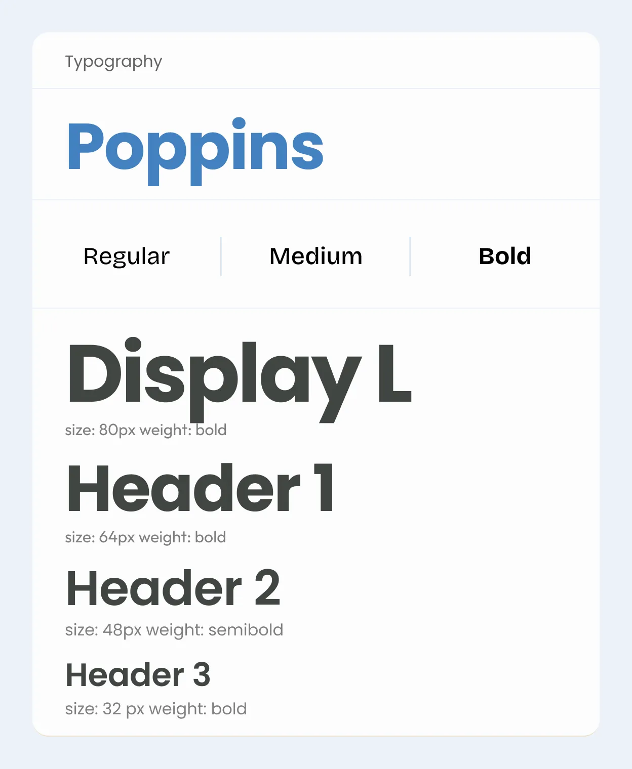
The hero section does three things at once. The headline — ‘Need help with your visa forms? Let us handle it.’ — states the problem and the solution in two lines. The character, a confident young man, tells the emotional story: this is someone who just received good news about his visa and is recommending the service. The social proof badge — 500+ forms completed without errors, five stars — sits in the top right of the hero card and answers the trust question before the visitor reads a single word of copy.
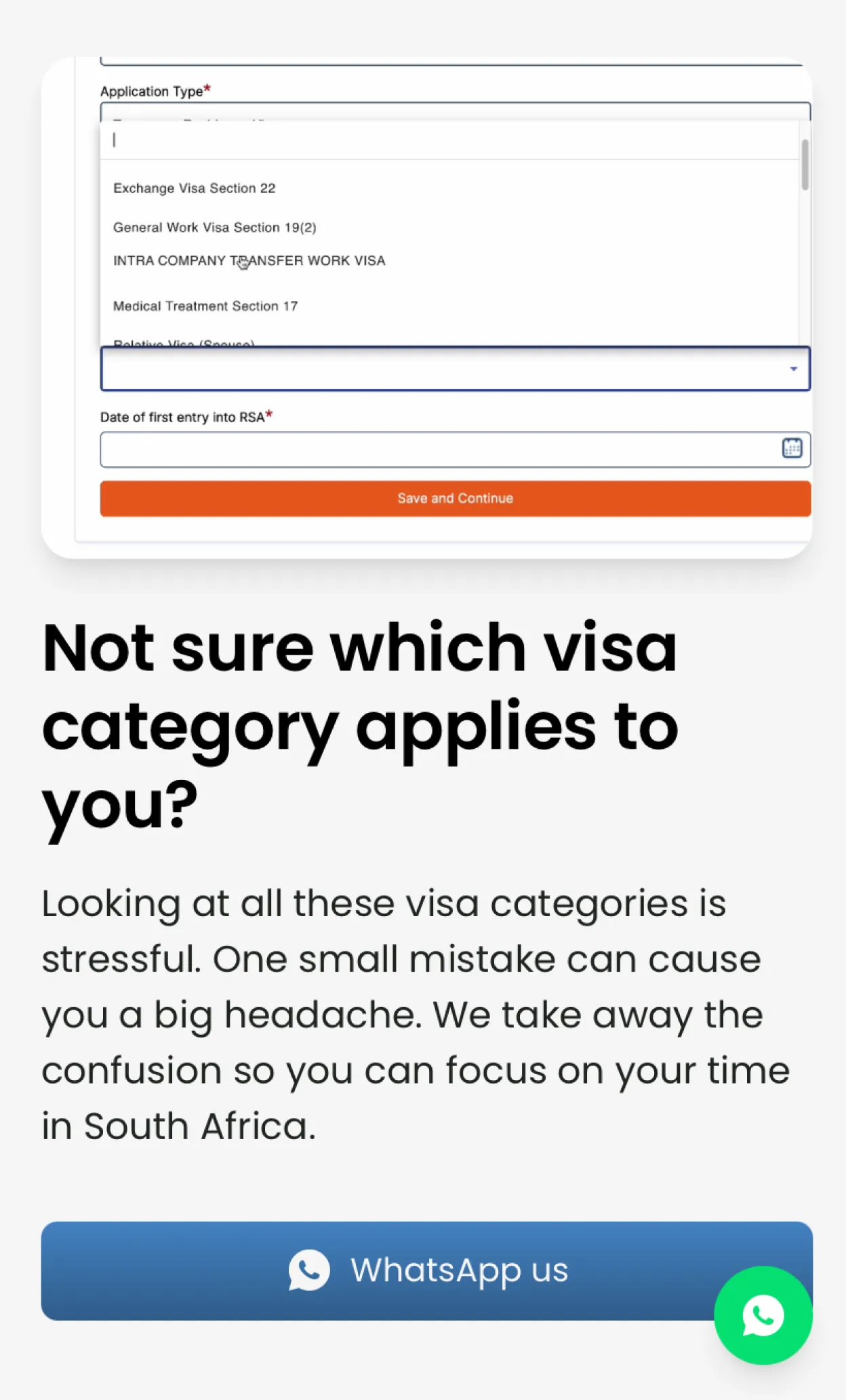
The visual problem section was one of the most important creative decisions on the project. The card plays a short video of the real Home Affairs visa dropdown — showing all 20+ categories scrolling past. It is deliberately overwhelming. The text reframes the chaos: ‘Not sure which visa applies to you’
Testing & Launch
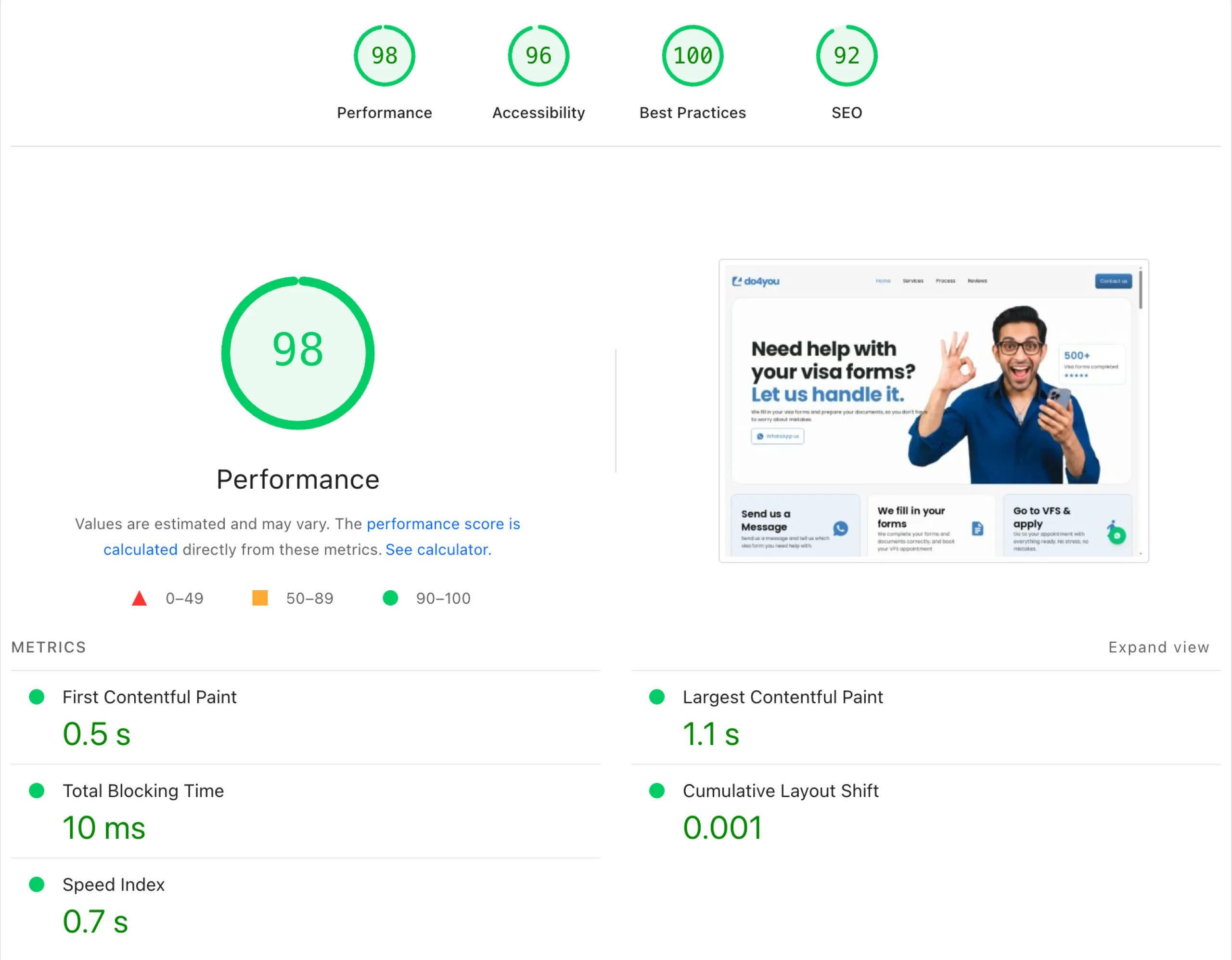
All design decisions were validated across screen sizes before handoff. The hero character, card layouts, and process section were tested at mobile, tablet, and desktop breakpoints. The WhatsApp CTA is prominent and tappable at every size. And as a result the landing page now has a 98% performance rating by Google.
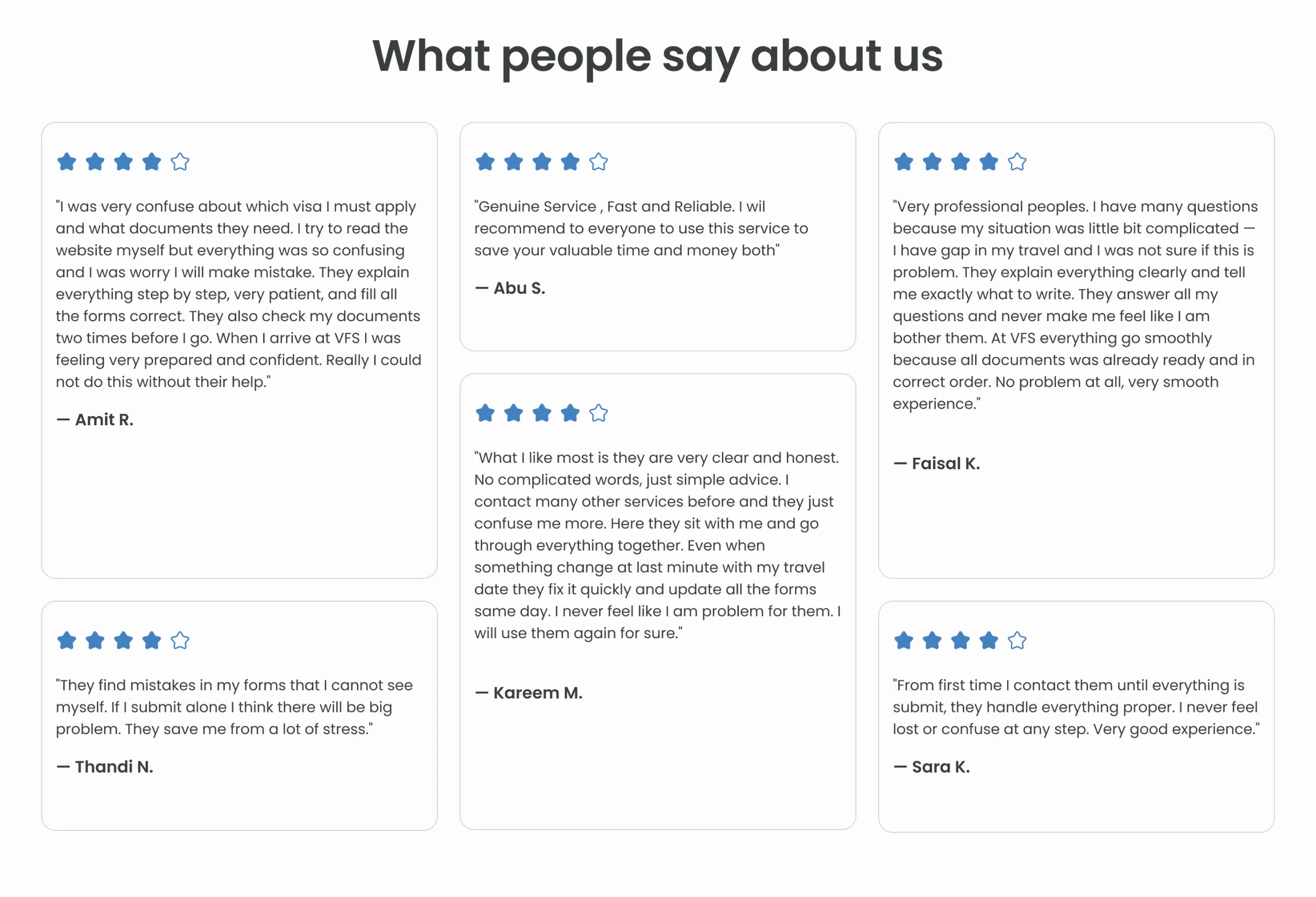
Testimonial
The client was happy with the outcome and provided a testimonial on completion of the project.
do4you.co.za — Case study by Fayda.Studio